The Phenomenology of Arrival
In following the debate over the future of New York’s Penn Station, two broad camps seem to have emerged on the issue. To broadly stereotype these opposing factions (the realities are in fact much more nuanced), one could label it as a fight between formalism and utilitarianism.
On one side are the elites of the architectural community, who see the project as an opportunity for a bold new architectural statement on a grand scale, not unlike the response to designing a new World Trade Center further downtown. SOM, for example, responded to the design challenge posed by the Municipal Art Society by proposing a massive orb-like structure floating in the air, suspended by a giant skyscraper on each corner of the site. Diller Scofio + Renfro made valid observations about the activities people engage in while waiting for trains and saw the potential for a new station to encapsulate many of those activities, but ultimately proposed a confusing warren of passageways that makes the current facility look like an exercise in clarity by comparison. Given the size of the site and the high-profile nature of the project, it’s hard to resist the temptation to respond with a formalistic grand gesture that asserts the superiority of the celebrity architect above all else.
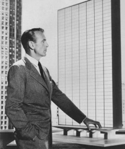
To the formalist architect, the station site is a blank canvas upon which to create a bold architectural statement that will be admired and studied by peers and those in the academy. The graphics used to visualize the design start with abstract diagrams that are often incomprehensible to all but the author, and slick renderings that are almost always from a birds-eye view, a vantage point that most people will never experience. And for those who do experience that vantage point, the station is so far removed from reality that issues related to its everyday experience are rendered irrelevant.
To use a fashion design analogy, the MAS schemes, to varying extents, were the architectural equivalents of models strutting down the runway at a fashion show filled with photographers and other industry people. This is all well and good for the purposes of beginning the conversation about the future of Penn Station, and in that regard the MAS Design Challenge was a success. But when it comes time to develop a serious proposal for the site, the design response must be grounded in the realities of the human experience.
At the other end of the spectrum are public transportation advocates and some advocates of New Urbanism — a vocal force in New York City — who want capacity improvements above all else, and whose distrust of architects is rarely left unexpressed. The example they often cite is Santiago Calatrava’s transportation hub at the World Trade Center, with a price tag of $4 billion (and counting). Calatrava’s space also falls into the “grand gesture” school of formalistic architecture, but does little or nothing to actually improve the capacity of the facility; the number of tracks and platforms for the PATH station there has remained unchanged since it was built around the turn of the 20th Century. To many who follow public transit, the end-all-and-be-all seems to be about the number of trains per hour the station can accommodate. All else is secondary.
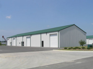
To the transit advocate or some New Urbanists, the architecture is irrelevant, a mere backdrop to urban life; what matters is moving trains in and out of the city. The default design response for transportation architecture in New York is the typical subway station: low, flat ceilings supported by a forest of structural columns, and machine-like efficiency of construction. The only nod to aesthetics, if the budget allows, is maybe a band of decorative tile or an art installation mounted somewhere out of the way.
Perhaps burned by the skyrocketing costs and endless delays encountered on other large-scale infrastructure projects in New York, they advocate an incremental, utilitarian approach. If a new station is to be built at all (Why not just add some skylights and a few additional escalators to the existing facility, or tinker with the train schedules a bit?), it should be done as quickly and cheaply as possible so that the city can get on with its business. Ancillary functions, such as retail or other uses, or the idea of re-envisioning the station as a destination in its own right rather than merely a portal to the city, are seen as superfluous window dressing conjured up by architectural elites in black turtleneck sweaters at ivory tower cocktail parties. To return to the fashion analogy, the favored approach would be sweat pants and a t-shirt: simple, functional, inexpensive, and low-maintenance.
Both arguments have valid points: given the size and scope of the project, architectural mediocrity in the form of a utilitarian shed is simply not an option. New York has been given a unique opportunity to reshape the public realm in this part of the city, and what gets built will reflect the city’s present-day aspirations for generations to come. Likewise, there are serious capacity and functional issues with the current facilities, and a failure to effectively address these issues will only confirm the worst stereotypes about architects and continue to marginalize the profession. The worst fear of the architects is that future generations will look at Penn Station and say, “Is that the best you could do?” The worst fear of the utilitarian camp is that future generations will look at Penn Station and say, “What the hell was that architect thinking?” Neither side can be blamed for having such concerns.
However, both sides make the mistake of ignoring the larger and more fundamental context in which the station exists. In both cases, the station is objectified and abstracted, removed from its network of uses and meanings that exist in the real world, and attention is focused solely on one metric at the expense of all others. The experience of the actual people who engage with the station on a daily basis is ignored: the commuter from Long Island, the occasional visitor, the retail worker, or the subway rider. Each of these people enters Penn Station and experiences it in a unique way; and each of those experiences takes place within a network of meanings that cannot be viewed in isolation from one another. These intertwined networks, and the associated character of the spatial experience, have largely been missing from the conversation so far. What does it really mean to arrive in New York City? How is the station used and experienced by the typical person on the street and on a train? How can a new station address its capacity issues while effectively enhancing the user experience? This is at the heart of phenomenology, the way of thinking and designing that acknowledges and enhances the web of meanings that form the human experience.
In the debate over the future of Penn Station, the issue of formalism vs. utilitarianism sets up a false choice between glossy, ego-driven structures designed by celebrity architects for maximum formal shock and novelty, and banal utilitarian structures designed by engineers for maximum efficiency for the lowest cost. What is needed is an approach to design that recognizes that good architecture is something that is experienced within the full context of the world we live in, and not a sculptural object or machine that exists in isolation. To revisit the fashion analogy once again, the false choice between runway model outrageousness and sweat pants misses the point; what is needed is something akin to a well-tailored suit that looks good, wears comfortably, enhances the occasion and gets noticed, and never goes out of style.
Precedent: Theme
What does it mean to arrive someplace? In the figurative sense, we use “arrive” as a word that implies having achieved a certain status; the business executive might say something like, “I’ll know I’ve arrived when I can afford a new Range Rover.” For architecture students, we know we’ve arrived when our thesis is approved and we graduate. The occasion, and other occasions like it, are marked with pomp and ceremony. Later on, we know we’ve arrived as architects when we pass the registration exams and receive a certificate and a drawing stamp, physical markers of arrival, and can legally call ourselves architects without a qualifier like “intern”. The professional title and the letters “AIA” after our names on business cards are further symbols of having arrived at a particular milestone in our careers.
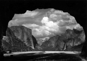
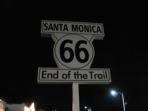
In the physical world, either by accident of geography or by design, certain places have spatial characteristics that let us know we’ve arrived someplace. Driving northbound on Interstate 75 through Northern Kentucky, we know we’ve arrived in Cincinnati when we pass over a rise on the highway and the downtown skyline opens up before us in the river valley below. From the south entrance of Yosemite National Park, the Wawona Tunnel on Highway 44 was deliberately sited by the Civilian Conservation Corps to provide a jaw-dropping panorama of Yosemite Valley and Bridalveil Fall upon emerging from the tunnel’s eastern portal after miles of driving through redwood forests. On the multi-day road trip on historic Route 66 from Chicago to Santa Monica, we know we’ve arrived at the end of our journey when the vista opens up from the crowded streetscape of downtown Santa Monica to the enormous expanse of the Pacific Ocean punctuated by the Santa Monica Pier.
While notions of mood and character as the foundation of human experience have largely been banished from the architectural academy in favor of dense theoretical treatises and dry parametric code, filmmakers have never lost sight of such notions. In the 1998 movie Dark City, Alex Proyas provides an example of how one might approach the idea of “arrival” in architecture. Throughout the movie, the protagonist — suffering from amnesia and trapped in a strange city — is attempting to find the way to his presumed hometown of Shell Beach. The film’s dramatic climax takes place between two visits to what we think of as Shell Beach; and before the first visit, the anticipation builds as we are led through increasingly dark and claustrophobic spaces. In the movie’s closing scenes, we are finally treated to a dramatic burst of sunlight as the protagonist opens a door at the end of a dark corridor and finds himself in the wide-open space of the ocean. There is no question that the protagonist has “arrived” at his destination.
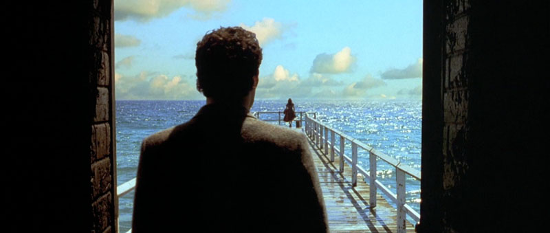
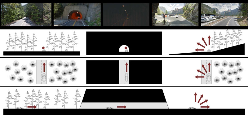
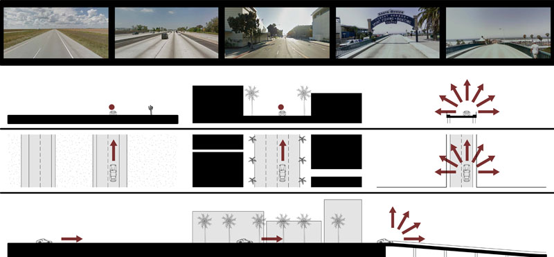
Each of these precedents involves a series of spatial conditions that can be best described as approach, threshold, and arrival. The threshold typically involves some sort of spatial compression in which our field of vision is narrowed, followed by a release in which the vista opens back up in dramatic fashion. More often than not, the arrival moment is marked by some icon or landmark to drive the point home, such as Bridalveil Fall in Yosemite or the “End of the Trail” sign on the Santa Monica Pier.
A phenomenology of arrival, then, probes the fundamental shifts of mood and character that accompany these sequences, and how spatial features in the environment, both natural and constructed, are able to “presence” them (make them more vivid and conspicuous),1 with meanings that enhance the human experience. This will be the goal of the new Penn Station.
Experience: Wawona Tunnel Entrance to Yosemite Valley

Completed in 1933 by the Civilian Conservation Corps, the Wawona Tunnel entrance to Yosemite Valley was carefully sited to provide a dramatic vista of the valley upon emerging from the eastern portal of the tunnel. Upon entering Yosemite National Park via State Route 41, motorists drive about 20 miles through evergreen forests on their way to Yosemite Valley, the iconic centerpiece of the park. The narrow confines of the 4233-foot tunnel constrict the driver’s field of vision; the tunnel exit is little more than a bright spot in the distance. The bright spot grows larger until the valley explodes into view, with Bridalveil Fall serving as a marker to indicate arrival in Yosemite Valley.
Experience: Santa Monica Pier
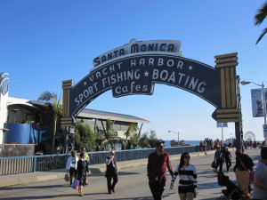
Although most of the original Route 66 has been supplanted by the Interstate Highway System during the postwar era, the Santa Monica Pier still serves as a fitting place to arrive after a cross-country road trip. Having traveled through forests, plains, mountain ranges, canyons, and deserts, motorists spend the last few miles traveling through the built-up sprawl of Los Angeles. Leaving the freeway, the motorist’s field of vision is compressed while passing through the dense local streetscape of downtown Santa Monica. After passing through an intersection and under a large sign marking one’s arrival at Santa Monica Pier, the view opens up dramatically toward the pier and the Pacific Ocean. The motorist has arrived at the edge of the continent, the end of the trail.
Experience: Dark City
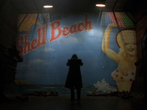
In the 1998 film by Alex Proyas, the protagonist John Murdoch finds himself in a strange city with no memories save for a few vague mental images of his hometown of Shell Beach. The film follows Murdoch as he tries to piece together the clues of his past and the city around him, and his search for Shell Beach. Toward the film’s climax, Murdoch finds his way through a desolate, forgotten quarter of the city to what he thinks is Shell Beach, traveling via a dark, narrow passageway. Murdoch returns to this location in the film’s final moments, and a dramatic explosion of light marks Murdoch’s arrival at Shell Beach.

Precedent: Typology
There are a number of precedents to reference when confronted with the challenge of adapting a existing train station to the modern-day needs of high-speed rail travel and intermodal connections. Most of these involve existing, historic train stations that have been creatively adapted and expanded to meet the needs of modern-day travelers and enhance connections with other transit service.
Although it involves the renovation of an existing structure rather than the construction of an entirely new facility, a comparable precedent in scale and scope would be the renovation and expansion of London’s historic St. Pancras Station (fig. 1.01) into a terminal for the high-speed Eurostar train to Europe, in addition to improving connections to the London Underground rapid transit network and to the adjacent King’s Cross railway station, which recently completed its own dramatic transformation. The renovations to St. Pancras involved the relocation of several platforms from the historic train shed to a newer shed to the north. The space within the main shed formerly occupied by the platforms was then opened up to the level below, which became a shopping concourse that provided covered, indoor access to the Underground and to King’s Cross. Modern immigration and customs facilities were added on this lower level for the Eurostar service, and the historic hotel that formed the stationís headhouse was meticulously restored. Renovations to nearby King’s Cross station, including the addition of a new ticketing hall, have further enhanced the connections between the two stations, effectively creating one major transit hub.
The example of St. Pancras can be applied to Penn Station on a number of levels. First and foremost is that of a creative reconfiguration of the space to create new circulation pathways, opportunities for retail development, and connections to other modes of transit in a manner that respects and enhances the station’s existing historic fabric. While Penn Station obviously has no need for international customs facilities as were required at St. Pancras, the renovation to St. Pancras has illustrated the potential of turning a historic train station into a modern gateway to the city that is at once cutting-edge and timeless.
A few miles south of St. Pancras International Terminal lies another precedent with valuable lessons for Penn Station. In the late 1990s, the Jubilee Line of the London Underground was extended east from central London to Stratford. The project included the construction of eleven new stations, most of which were in areas with little prior access to the Underground system, some of which provided new transfer points between the Underground and mainline railway stations (particularly at Waterloo, London Bridge, and Stratford), and all of which were fresh expressions of the potential of railway architecture. The new station at Westminster (fig. 1.02) provided a novel solution to the problem of providing new connections to existing Underground service within the tight confines of a site surrounded by historic structures, while also serving as a monumental gateway to one of London’s most heavily-visited tourist areas. Norman Foster’s Canary Wharf (fig. 1.03) station provided transit access and a civic icon for Londonís rapidly-developing new financial district in an area once dominated by shipyards and docks. While the Jubilee Line’s extension serves a different mode of rail transit compared to Penn Station and St. Pancras, it offers lessons regarding how innovative, forward-looking architecture can transform urban areas that were once left for dead and make rail transit attractive to the general public.
Pennsylvania Station, 1910-1963
When searching for an archetypical precedent for the design of a new Penn Station, one needs to look no further than the original building that occupied the site. The neoclassical structure designed by McKim, Mead, and White effectively defined the genre of the great urban railway station in the United States at a time when the invention of rail travel was still within living memory. Its 1963 demolition and banal replacement remain an open wound in the collective consciousness of New York’s design community, the national historical preservation movement, and for hundreds of thousands of people who use the station each day.
Background
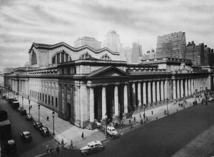
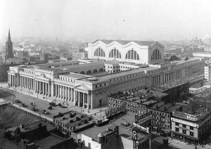
Pennsylvania Station was only one part of the Pennsylvania Railroad’s (PRR) herculean efforts to overcome geography and provide direct rail service to Manhattan. Prior to its construction, passengers from New Jersey, Philadelphia, and points south and east were forced to disembark their trains on the Hudson River waterfront near the site of today’s Exchange Place PATH station (hence its name) and transfer to ferries in order to cross the river and reach Manhattan. The Long Island Rail Road, then a subsidiary of the PRR, faced the same problem from the east; passengers were forced to transfer to ferries in Queens and cross the East River into Manhattan. Meanwhile, the PRR’s arch-rival, the New York Central, was able to provide direct rail service into Manhattan via its lines that traveled through the Bronx and Harlem, and under Park Avenue to a passenger terminal at 42nd Street. (Three years after the opening of Pennsylvania Station, this passenger terminal would be replaced with the Grand Central Terminal that serves Metro-North Railroad commuters today.)
To gain a competitive advantage against the New York Central, the PRR embarked on a massive capital project that would involve the construction of Newark Penn Station in New Jersey, tracks across the tidal marshes of the Meadowlands, the two 2.8-mile-long North River Tunnels under the New Jersey Palisades and the Hudson River, a monumental passenger station in Midtown Manhattan, four additional tunnels under Manhattan and the East River, the Hell Gate Bridge and its approaches, track connections to the New York Central northeast of the city, and massive rail yards on Manhattan’s west side and in Sunnyside, Queens.2 The use of tunnels instead of bridges into Manhattan necessitated that the trains be electric — still nascent technology at the time — rather than steam-powered, and cemented the PRR’s reputation as one of the most innovative railroads of the age.
Although the original Penn Station built at this time has since been demolished, the other components of this project remain in place, and still serve as critical parts of the region’s transportation network. Following the Pennsylvania Railroad’s ill-fated merger with the New York Central in 1968, and subsequent bankruptcy of the combined Penn Central railroad two years later, this infrastructure ultimately came under the ownership and operation of Amtrak in 1976, when Amtrak was created by the federal government to shift passenger operations away from the private railroads. These facilities form a critical part of Amtrak’s Northeast Corridor between Washington and Boston, and are now shared by Amtrak, NJ Transit, and the Long Island Rail Road.
Exterior
At the time of its construction, Penn Station dominated the surrounding structures in the neighborhood, which consisted mainly of 4 to 5-story tenement buildings; Manhattan’s famous skyscrapers were, at that time, located in Lower Manhattan or further east along Broadway. The station’s exterior was made of Milford Pink granite, and featured dramatic colonnades along the east and west facades, facing Seventh and Eighth Avenues, respectively. The primary entrance to the station was via the center of the east facade on Seventh Avenue. Secondary entrances were located on Eighth Avenue, 31st Street, and 33rd Street. Enclosed carriageways along 31st and 33rd Streets provided direct access from the station to carriages and then taxis.
Waiting Room
Penn Station’s architects operated firmly within the Beaux-Arts tradition for which they were most well-known, and took inspiration from the ancient Roman baths of Caracalla3 for the design of the station’s imposing waiting room, located at the center of the structure and reached from Seventh Avenue via an arcade lined with shops and services. Flanked by massive Corinthian columns and over 150 feet tall, the waiting room formed New York’s largest indoor public space.4 The lower portions of the waiting room were clad in travertine marble; the upper portions in plaster painted to match the travertine. The barrel-vaulted ceiling featured coffers that evoked St. Peter’s Basilica in Rome.
Concourse
Moving westward from the waiting room, passengers entered the dramatic, daylit concourse that provided access to the platforms below. Whereas the waiting room took its inspiration from antiquity, the concourse evoked the Crystal Palace and the great train sheds of the Industrial Revolution such as London’s St. Pancras Station. A novel design feature was the use of glass block for the floors, allowing daylight to reach the platforms located approximately fifty feet below street level. Another novel feature was a separate exit concourse located directly below the main concourse, allowing arriving passengers to leave the station without mixing with departing passengers. The main circulation patterns were simple and intuitive, based on a symmetrical plan with a central axis in line with 32nd Street, which met Seventh Avenue at the station’s main entrance.
Demolition
“Until the first blow fell, no one was convinced that Penn Station really would be demolished, or that New York would permit this monumental act of vandalism against one of the largest and finest landmarks of its age of Roman elegance,”5 wrote the New York Times editorial board on October 30, 1963, as crews began hammering away at the structure.
Although Penn Station saw its highest passenger volumes during World War II, the postwar years saw the decline of rail travel in favor of the automobile and airplane. The cash-strapped Pennsylvania Railroad, faced with declining revenues and exorbitant costs to maintain the station, made the decision to sell the air rights above the platforms to developers building a new Madison Square Garden and commercial office towers. The city’s design community rallied to save the structure, but to no avail. The demolition of Penn Station galvanized a then-nascent historic preservation movement that, in a few years, would successfully save Grand Central Terminal from Penn Station’s fate. Despite a patchwork of minor improvements — namely the construction of two new entrances and a new concourse for NJ Transit — and some minor cosmetic upgrades, today’s Penn Station has remained largely the same underground dungeon that has greeted travelers since 1963.
The New York Times editorial of that year continued, “Any city gets what it admires, will pay for, and, ultimately, deserves. Even when we had Penn Station, we couldn’t afford to keep it clean. We want and deserve tin-can architecture in a tin-horn culture. And we will probably be judged not by the monuments we build but by those we have destroyed.”6
Other Precedents
Grand Central Terminal, New York
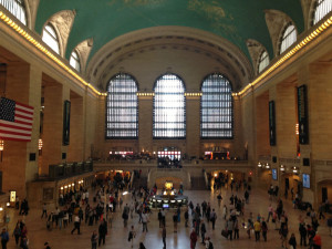
Built by the Vanderbilt family three years after the opening of Penn Station, Grand Central is the last of Manhattan’s two opulent railway stations of the Gilded Era. The design of Grand Central was inspired by the same Beaux-Arts sensibilities as Penn Station, and like Penn Station, Grand Central features a central circulation spine that leads from a central entrance through an opulent waiting room (now an event space known as Vanderbuilt Hall) to a vast central concourse that collects and distributes travelers and serves as a primary focal point of the station.
As with Penn Station, Grand Central was threatened with demolition in the 1960s. Spurred by the demolition of Penn Station earlier in the decade, preservationists were ultimately successful in saving Grand Central. Jacqueline Kennedy Onassis took up the preservationist cause and became its figurehead, saying:
Is it not cruel to let our city die by degrees, stripped of all her proud monuments, until there will be nothing left of all her history and beauty to inspire our children? If they are not inspired by the past of our city, where will they find the strength to fight for her future? Americans care about their past, but for short term gain they ignore it and tear down everything that matters. Maybe… this is the time to take a stand, to reverse the tide, so that we won’t all end up in a uniform world of steel and glass boxes.7
A bronze plaque in tribute to Jacqueline Kennedy Onassis now occupies the north wall of Vanderbilt Hall. Grand Central Terminal underwent a comprehensive restoration in the late 1990s, and celebrated its centennial anniversary in 2013. Although the station serves only a quarter of the passengers as Penn Station today, it is by far the more gracious and monumental of the two facilities, and without question the more beloved.
30th Street Station, Philadelphia
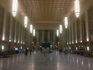
Continuing the Pennsylvania Railroad’s long tradition of innovation, 30th Street Station, built a generation after Penn Station during the peak of the PRR’s heyday, solved a longstanding challenge imposed by Philadelphia’s geography and provided a monumental gateway to the city for long-distance travelers. Long-distance trains had formerly used Broad Street Station in downtown Philadelphia, located on spur tracks west of the railroad’s main line on the western bank of the Schuylkill River. As a result, trains were forced to reverse direction to serve the station. The PRR solved this issue by building 30th Street Station directly on the main line, allowing long-distance trains to bypass the spur and Broad Street Station altogether. At the same time, Broad Street Station was replaced with Suburban Station, which would be dedicated solely to commuter use.
Designed by the Chicago firm of Graham, Anderson, Probst, and White (the successor firm to the venerable D. H. Burnham and Company), the exterior of the station featured a neoclassical exterior and a vast waiting room that combined neoclassical and Art Deco elements. Unlike at Penn Station and Grand Central, where the waiting room and main concourse were two distinct spaces, the concourse at 30th Street Station combined the two functions into one space. As with Grand Central Station and the former Penn Station, sunlight is allowed into the space in generous quantities, but in a filtered manner. Large vertical light pendants provide additional lighting and help define the space.
Oglivie Transportation Center, Chicago
The postwar years were not kind to America’s passenger railroads and train stations. In addition to the demolition of Penn Station, architecturally-significant parts of Chicago’s Union Station and Cincinnati’s Union Terminal were demolished. Detroit’s Michigan Central Station and Buffalo’s New York Central Terminal were simply abandoned and left to crumble. In the early 1980s, joining the long list of historic railroad terminals being demolished to make way for high-rise office development was the stately head house of the Chicago & North Western Railroad in downtown Chicago.
In this case, however, the developers broke from the script — which would have normally called for passenger facilities to be relegated to a dank, low-ceilinged space similar to what Penn Station had become — and commissioned Helmut Jahn to design a bright, airy passenger concourse that would also serve as a grand lobby for the 42-story office building above. To do this, lowest floor of the tower’s elevator banks were lifted to a sky lobby above the concourse, accessed by escalators. This freed up ground-level space for generous passenger facilities, with exposed steel structural members, large skylights and clerestory windows, and strategically-placed illuminated billboards evoking the great urban train stations of Europe. As with the previous examples, circulation patters are simple and intuitive, and natural light (in this case through north-facing windows) is brought in generously but in a controlled manner.
Summary
Despite the wide variety of settings and circumstances surrounding these precedents, some commonalities can be distilled:
- Materials that convey a sense of permanence and monumentality: granite, travertine, limestone, bronze.
- Clear, intuitive circulation that is self-evident and easy to navigate. In all cases, the sequence of spaces is as follows: 1) entry passage with retail, 2) waiting room / concourse, 3) train platforms.
- A large central concourse to serve as a collector / distributor for circulation and as a focal point for the facility.
- Ample sunlight that is brought into the space in a controlled manner, with appropriate filtering and/or north-facing glazing to reduce glare and heat gain.
Experience: Original Penn Station
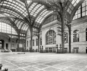
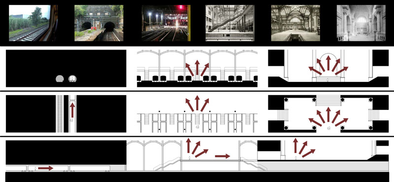
The original Pennsylvania Station and its associated infrastructure featured a dramatic sequence of spatial conditions when arriving from New Jersey or Long Island. From either location, trains passed through the low-density outskirts of the city before descending into long tunnels to pass under waterways. The trains would slow down and change tracks as they went through various interlockings as they approached the station. The darkness outside the train windows would be dramatically replaced with natural light as the train pulled into a platform at Penn Station. Upon disembarking from the train, passengers walked up stairs to an airy, glass-enclosed concourse which then led to a massively-scaled neoclassical waiting room.
Experience: Lyon Airport Station
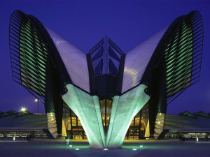
Located on the outskirts of Lyon, France, this station by Santiago Calatrava connects that city’s airport to the French TGV system and local rail transit, allowing the airport to serve passengers from as far away as Paris. Upon arrival at the station, passengers ascend to a wide concourse that leads them to the main ticketing hall. This dramatic, light-filled space serves as a node connecting the train station to the airport as well as an iconic landmark of the airport itself.
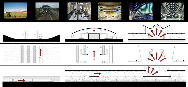
Experience: Gotham Gateway
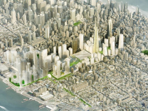
The Gotham Gateway is the proposal for a new Penn Station by SHoP Architects, as presented to the Municipal Art Society in May 2013. Although the station itself is new, the infrastructure used by trains on their approach to the station is largely the same as what served the original Penn Station. As such, the approach sequence is similar: trains pass through low-rise suburban areas, followed by a tunnel crossing under either the Hudson River or the East River, followed by arrival at the station. As with the original Penn Station by McKim, Mead, and White, passengers disembark onto platforms bathed in diffused sunlight from above, and then ascend to a large open concourse before continuing to their final destination.

Illustration Credits
All illustrations by the author unless otherwise indicated.
Fig. 3.01: The Fountainhead, Warner Brothers, 1949
Fig. 3.02: Qingdao Xinguangzheng Steel Structure Co., Ltd.
Fig. 3.03: Ansel Adams
Fig. 3.05: Dark City, New Line Cinema, 1998
Fig. 3.07: Photos: Google Street View
Fig. 3.09: Photos: Google Street View
Fig. 3.10: Dark City, New Line Cinema, 1998
Fig. 3.11: Photos: Dark City, New Line Cinema, 1998
Fig. 3.12: Wikimedia Commons
Fig. 3.13: Wikimedia Commons
Fig. 3.16: Detroit Publishing Company, via Shorpy Historical Photo Archive
Fig. 3.17: Photos: Detroit Publishing Company via Shorpy Historical Photo Archive
Fig. 3.18: arcspace.com
Fig. 3.19: Photos: arcspace.com
Fig. 3.20: SHoP Architects, presentation to the Municipal Art Society, May 2013
Fig. 3.21: Renderings: SHoP Architects, presentation to the Municipal Art Society, May 2013
Notes
- Karsten Harries, The Ethical Function of Architecture, Cambridge, Massachusetts: MIT Press, 1997, pp. 118-121.
- The New York Times, “Nearly Twenty Miles Through Tubes and Tunnels,” 9 November 1908.
- Frederick N. Rasmussen, “From the Gilded Age, a monument to transit”. The Baltimore Sun, 21 April 2007.
- ibid.
- The New York Times, “Farewell to Penn Staton,” editorial, 30 October 1963.
- ibid.
- Jacqueline Kennedy Onassis, letter to New York Mayor Abraham Beame, quoted in “The Surprising Role Jackie Kennedy Onassis Played in Saving Grand Central” by Tina Cassidy, The Atlantic Cities, 5 February 2013, [http://www.theatlanticcities.com/politics/2013/02/surprising-role-jackie-kennedy-playing-saving-grand-central-station/4596/] Retrieved 18 August 2013.

